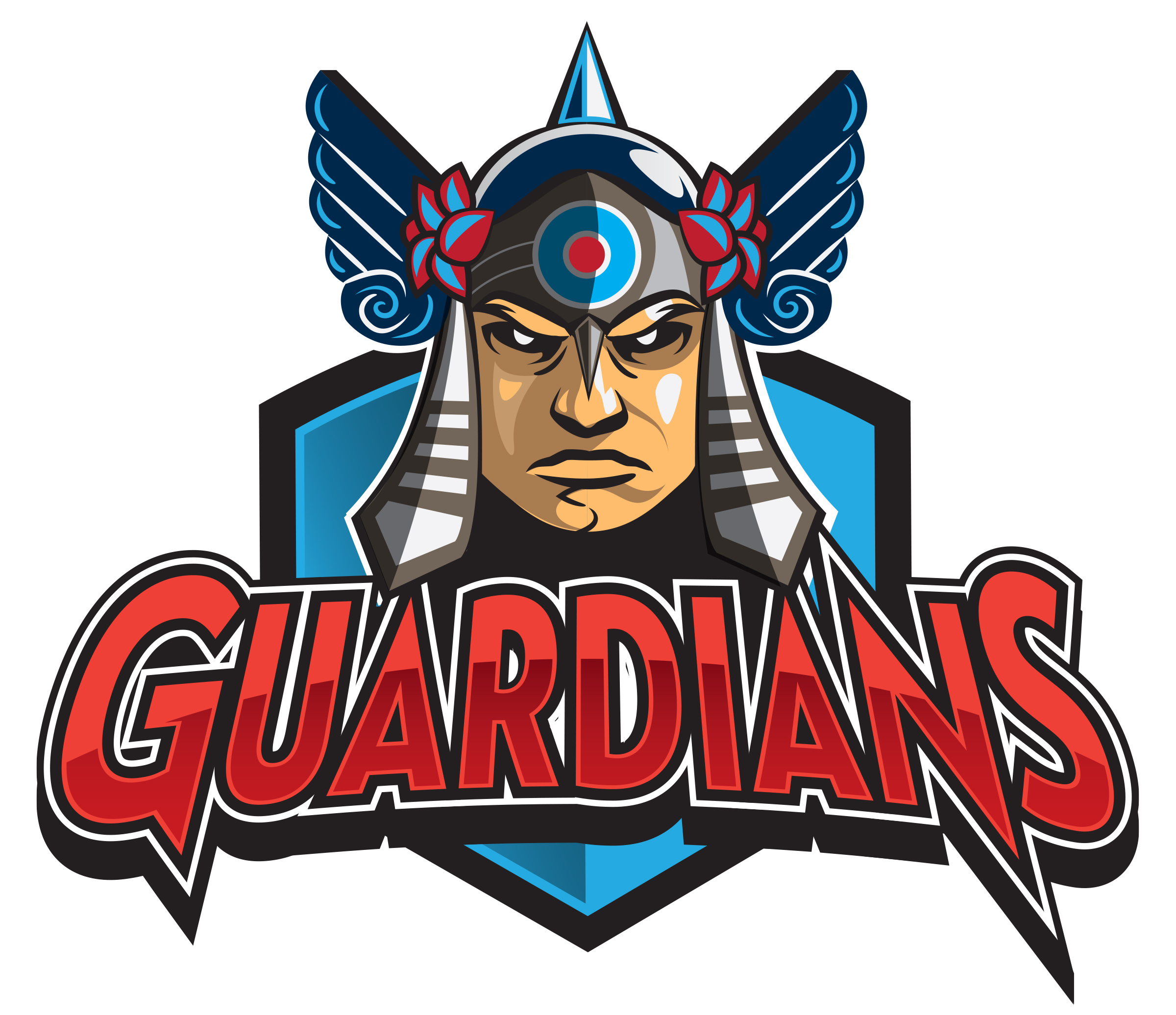
Cleveland Guardians Logo Concept
When the Cleveland Indians announced that they were changing their name and mascot to the Guardians, I wanted to take the chance to develop an identity of my own.
Keeping the red, white and blue theme of the previous mascot/icon, I wanted to use a typeface that was completely different to firmly establish this new identity.
Using the famed Cleveland traffic guardians as direct inspiration, I wanted to give this guardian a decidedly tougher look, while also including some subtle and not-so-subtle references to the sport of baseball itself.